Creating a Divi MadMenu Header. Part 3: Login Form and User Account Menu
This is the Part 3 of the tutorials series about how to create a header using the Divi MadMenu extension, in this tutorials series we are creating the Divi MadMenu Header Template #13.
In this tutorial we are going to create the header Login Form and the User Account Menu.
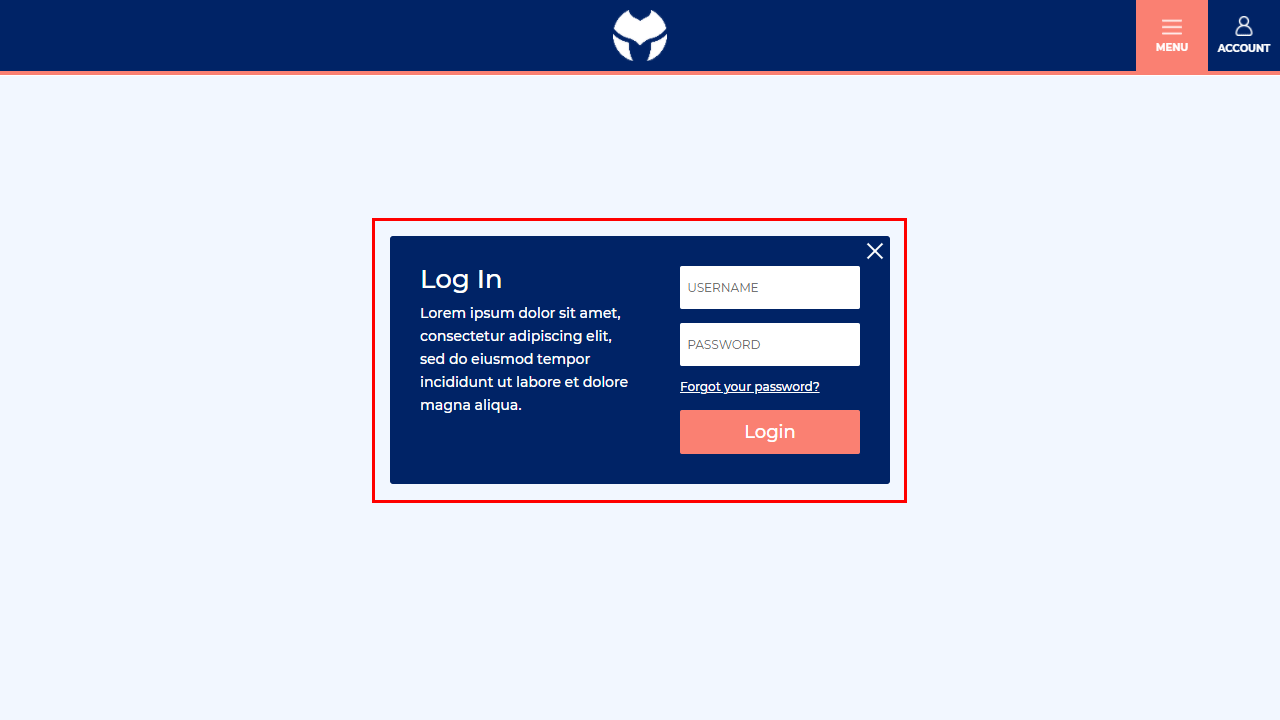
The Login Form will be dispalyed as a popup when the logged out user clicks the Account button of the main menu bar. This will allow the user to log in without being redirected to a different login page.
And the User Account Menu will slide in from right when the logged in user clicks the Account button.
It contains all user account related links as well as the logout button allowing the user to log out.
If you did not do the Part 1 and Part 2 yet I highly recommend you to do them first and then continue with this tutorial.
However, you can skip previous tutorials if you like, just download the header template that we’ve created in Part 2 and import it into the Theme Builder so that you can follow this tutorial from where we left in the previous part.
Adding the Login Module
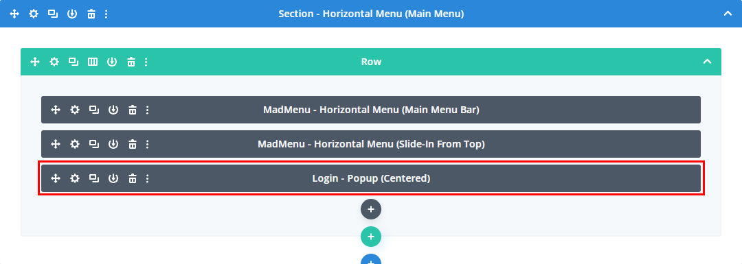
The Login form will be shown as a popup and to create it will use the Divi Login module which we’ll add into the same row and column where we already have the main menu bar and the horizontal slide-in menu.
Creating the Login Form Popup
In order to turn the Login module into a popup first we need to add a unique ID to the Login module Advanced -> CSS ID & Classes -> CSS ID field.
Let’s use the userLogin ID for demo purposes, you can use any other ID if you like, just make sure it’s not used anywhere else on your site or the pages where you’ll use this header on.
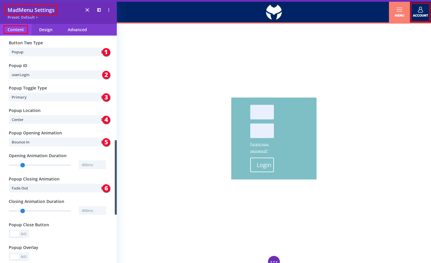
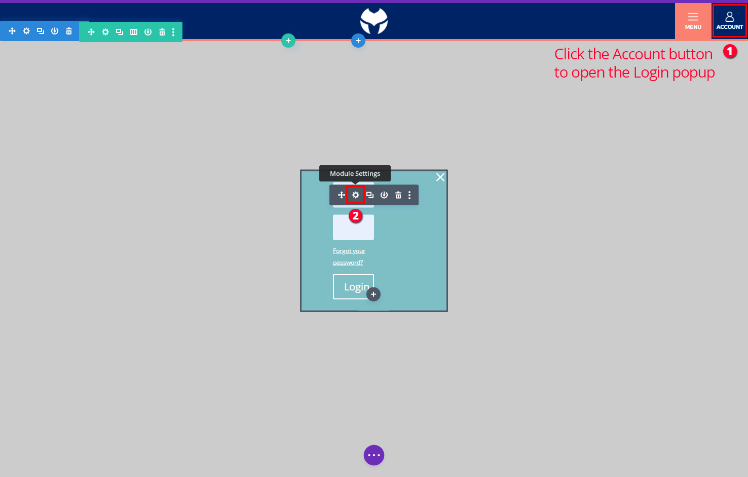
Then add the same popup ID to the Account button(the Button Two element) of the main menu bar in MadMenu Settings -> Content -> Popup ID. Let’s configure all the popup settings as well:
- Set the Account button type to Popup.
- Set the popup ID(it must be the same ID that we’ve added to the Login module): userLogin.
- The Account button is the only toggle of the Login form popup, so, set the Popup Toggle Type to Primary.
- The popup should be centered.
- Set the popup opening animation to Bounce In.
- Set the popup closing animation to Fade Out.
Now if you click the Account button the Login popup will show/hide.
Let’s also apply the rest of the login popup settings:
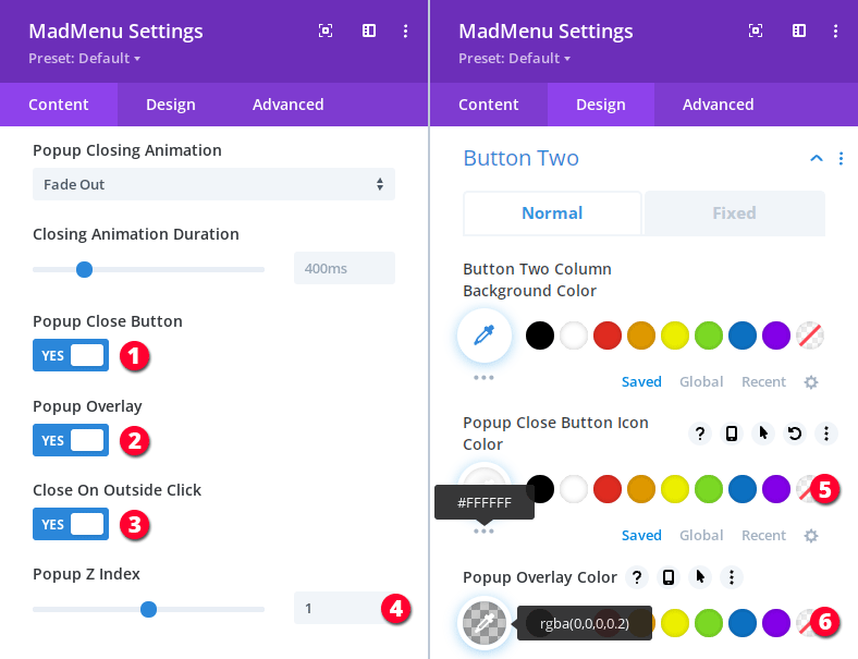
- Add the popup close icon.
- Enable popup overlay.
- Make the popup close on outside click.
- Set the Login popup z-index. We don’t want the popup overlay to cover the main menu bar which has a z-index of 2(two), so, we need to set the Login popup z-index to 1(one).
- Set the popup Close Button icon color to #ffffff in Design -> Button Two -> Popup Close Button Icon Color.
- Set the popup overlay color in Design -> Button Two -> Popup Overlay Color.
Styling the Login Popup
Now let’s style the Login form so that it matches the overall header design.
Click the Account button once to open the Login form popup and then open the Login module settings pane to add it’s content and apply the styling.
Since we are using Divi’s built-in Login module we can design it using it’s settings just like with any other Divi module.
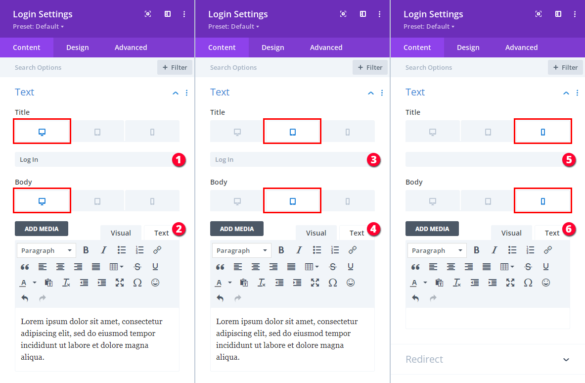
Let’s first add the Login module content for all devices in Login Settings -> Text section:
- Add title for Desktop.
- Add body text for Desktop.
- Add title for Tablet.
- Add body text for Tablet.
- Remove the title for Phone.
- Remove the body text for Phone.
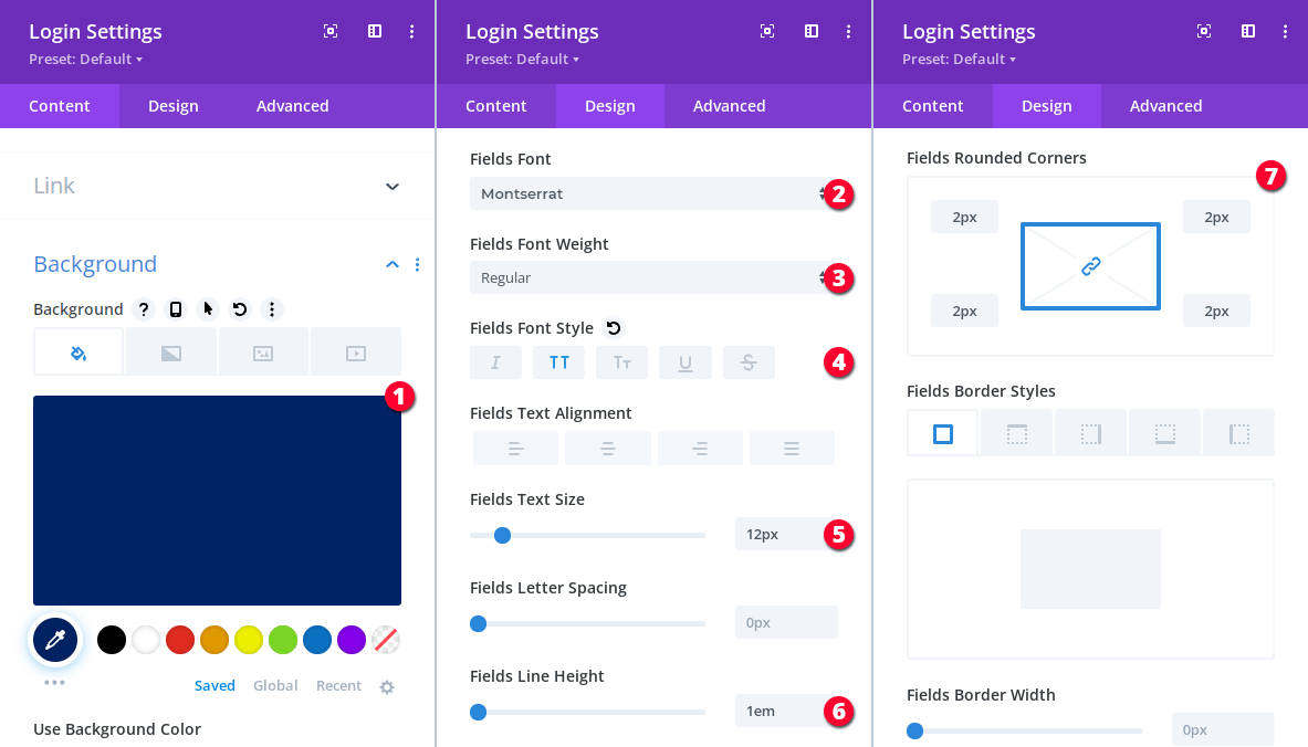
Let’s also apply the Login module background color in Login Settings -> Content -> Background, and the fields text styling and border radius in Login Settings -> Design -> Fields:
- Background: #002366.
- Fields font: Montserrat.
- Fields font weight: Regular.
- Fields font style: uppercase.
- Fields text size: 12px.
- Fields line height: 1em.
- Fields border radius: 2px.
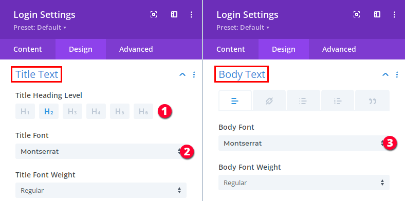
Next, apply the title and body text settings in Login Settings -> Design -> Title Text and Login Settings -> Design -> Body Text sections respectively:
- Title heading level: H2.
- Title font: Montserrat.
- Body font: Montserrat.
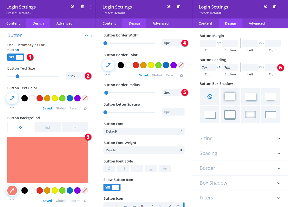
To apply the Login form button styling go to Login Settings -> Design -> Button:
- Enable custom button styles.
- Set the button font size to 18px.
- Set the button background color to #fa8072.
- Remove the button borders: 0px.
- Set the the button border radius to 2px.
- Set the button top and bottom padding to 7px.
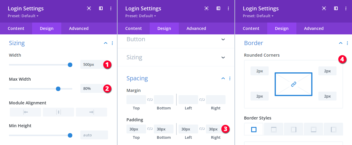
Let’s also set the Login module width, max-width, spacing and border radius:
- Set the width to 500px (in Login Settings -> Design -> Sizing).
- Set the max-width to 80% (in Login Settings -> Design -> Sizing).
- Set the padding to 30px (in Login Settings -> Design -> Spacing)
- Set the module border radius to 2px (in Login Settings -> Design -> Border).
The Login popup should only be displayed to logged out users, so, we need to hide it from the logged in users.
Divi MadMenu will hide it using CSS, however, Divi also provides a way to control the element visibility depending on different display conditions including the user logged in status.
You can control the element conditional visibility by using the Conditions feature available in Divi since v4.11. We’ll use this feature to hide the Login popup from the logged in users (and the User Account Menu from the logged out users later in this tutorial).
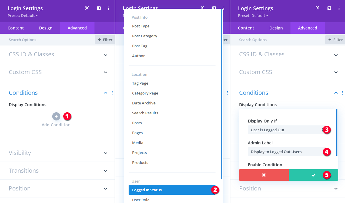
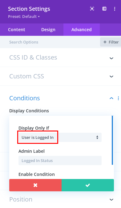
So, to hide the Login popup from the logged in users go to the Login Settings -> Advanced -> Conditions section and add a Logged In Status condition to display the module for logged out users only.
- Click to add a new condition.
- Select the Logged In Status condition.
- Set to display the module only if the User is Logged Out.
- Add a short and meaningful admin label for this condition (optional).
- Click to apply the condition.
That’s it for the Login popup, a logged out user can now click the main menu bar Account button and the Login popup will appear allowing the user to log in using his/her login credentials.
We also need to allow the logged in user to log out and the Login module displays the logout link when the user is logged in.
However, since we’ve set the Login popup to display to the logged out users only, the logged in user won’t be able to log out using the Login module logout link.
But we don’t need that because we’ll add a logout button to the User Account Menu later in this tutorial.
Now let’s create the User Account Menu.
Creating the User Account Menu
The User Account Menu is again just a popup that is toggled when the logged in user clicks the Account button of the main menu bar.
Whereas if the logged out user clicks the same Account button then the Login form popup is displayed instead of the user account menu.
So, basically, we are using the same MadMenu Button element to display two different popups depending on the user’s logged in status.
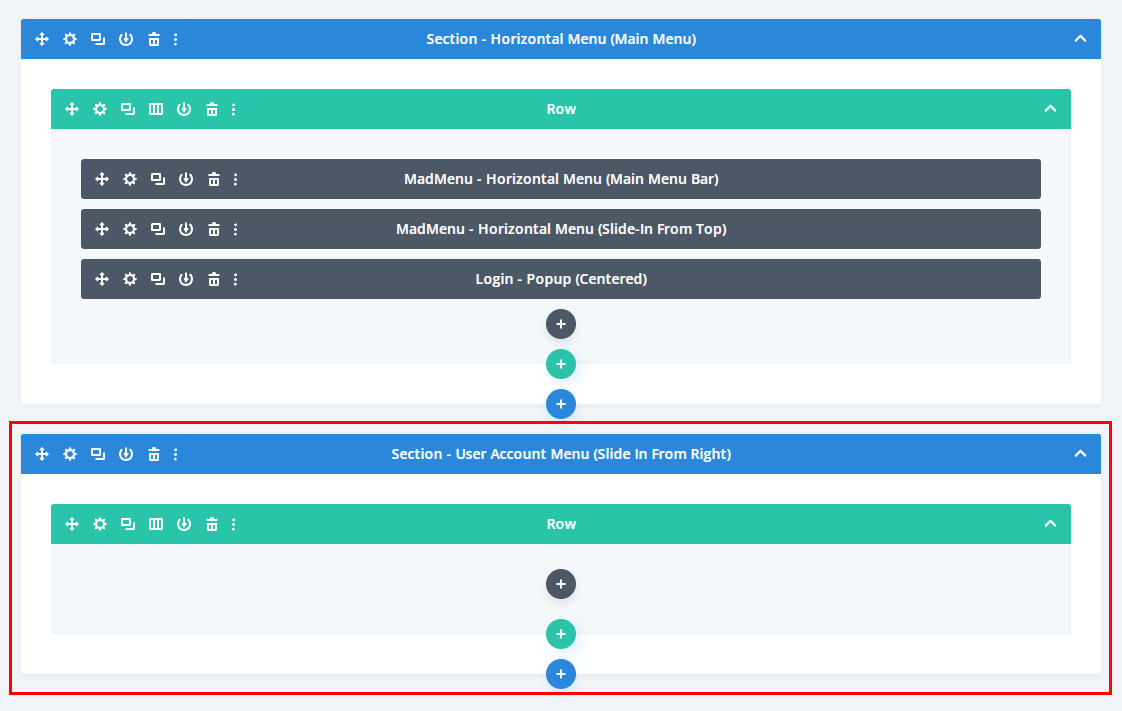
To create the User Account Menu we’ll use a new section (so far we’ve been using modules for creating popups: the horizontal slide-in menu and the Login form) which will be added as a popup to the Account button element in it’s Auth content settings.
First, let’s design the User Account Menu section, then add it to the Account button as a popup, and after that add the menu content.
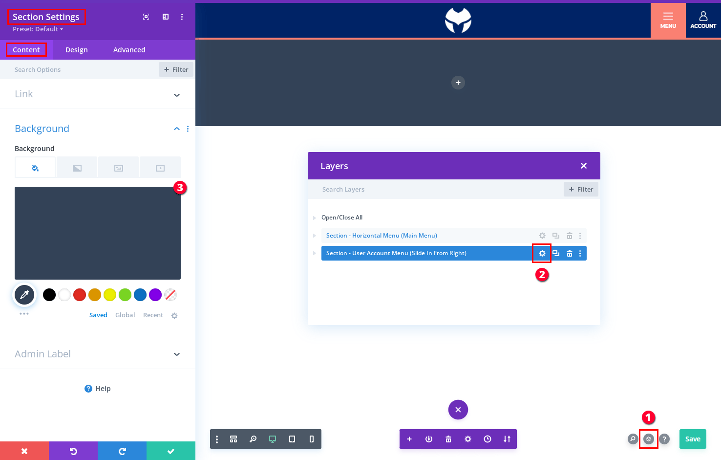
- Open the Layer view.
- Open the section’s settings pane.
- Set the background color to #334257.
Then let’s apply the section sizing and spacing settings and assign it a unique ID that will be used as the popup ID:
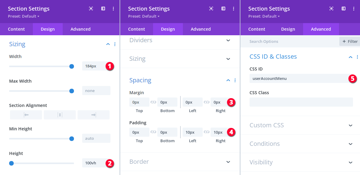
- Set section width to 184px.
- Set section height to 100vh.
- Set section margin to 0px.
- Set section padding to 0px 0px 10px 10px (we only need left and right padding).
- Assign a unique ID to the section, the same ID should be added to the Account button Auth popup settings. We use the userAccountMenu ID for demonstration purposes here, but you need to make sure you use an ID that is not used anywhere on your site where this header will be displayed.
To display this section as a popup to the logged in users we need to use the Auth settings of the Account button.
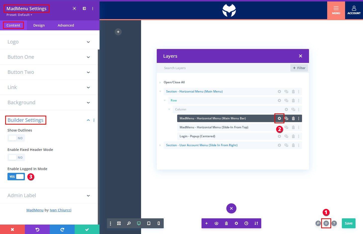
However, before we add and configure the Auth popup settings we need to enable the Logged In Mode so that when we click the Account button the user account menu is displayed but not the Login form(if you click the Account button now, the Login form shows up).
To switch to the logged in mode go to the Content -> Builder Settings of the main menu bar MadMenu module and enable the Enable Logged In Mode setting.
This setting works in Divi Builder interface only and is intended to “fake” the logged in status so that it is possible to work with the Auth content.
If you need to view or edit the Login popup again you can always disable the logged in mode, and then clicking the Account button will display the Login popup.
- Open the Layer view.
- Find the Main Menu Bar MadMenu module and open it’s settings.
- Go to the Content -> Builder Settings and enable the logged in mode.
Now go to the Account button settings to configure the popup(the user account menu) settings.
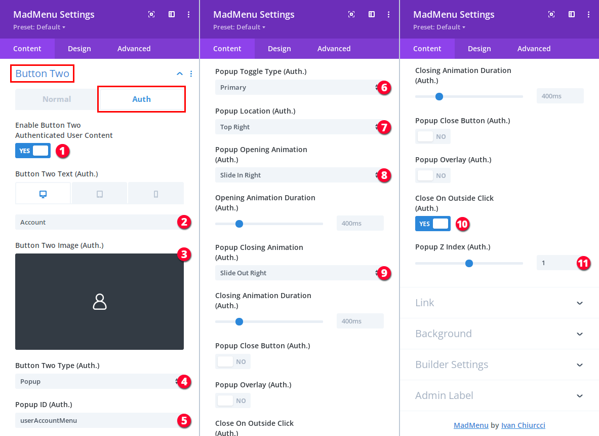
The Account button is the Button Two element of the main menu bar MadMenu module, we need to enable the authenticated user content in the MadMenu Settings -> Content -> Button Two -> Auth tab and add the button content and apply the popup settings there:
- Enable the logged in user content.
- Add the button label for Desktop and Tablet, and remove it for the Phone device.
- Add the button icon.
- Set the button type to Popup.
- Add the the popup ID (the one we’ve added to the user account menu section): userAccountMenu.
- The Account button should be the Primary toggle for the user account menu.
- Set the user account menu location to Top Right.
- Select the Slide In Right opening animation.
- Select the Slide Out Right closing animation.
- Make the user account menu closes when clicked somewhere outside.
- Set the user account menu z-index to 1(one) so that the main menu bar overlaps it.
The user account menu is ready, you can toggle the Logged In Mode in the Builder Settings section and click the Account button to see that both the Login form popup and the User Account Menu are showing/hiding as expected.
The last thing we need to do before adding the menu content is to add a Logged In Status display condition to the user account menu section in it’s Advanced -> Conditions section so that it’s displayed to logged in users only.
It should be done the same way as we did for the Login form popup except that we need to select the User Is Logged In option for the Logged In Status display condition in the user account menu section.
User Account Menu Content
Now let’s add the user account menu contents.
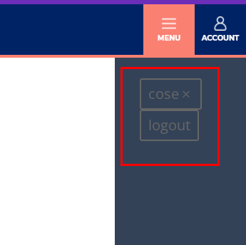
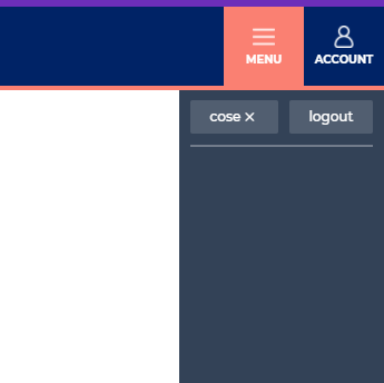
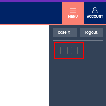
Our user account menu will have a Close button for closing the menu and a Logout button to allow the user to log out.
And we’ll add a few menu items to the menu but you can add any other content you like.
Create the Close and Logout Buttons
We’ll use the Divi MadMenu module for creating the menu Close and Logout buttons.
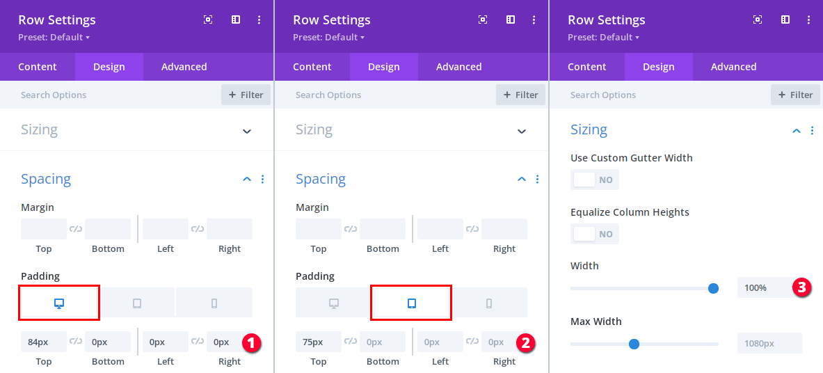
But first let’s ensure that the menu content won’t be overlapped by the main menu bar by adding some padding-top to the user account menu row, this will push the menu content down:
- Add padding for Desktop: 84px 0px 0px 0px.
- Add padding for mobile: 75px 0px 0px 0px.
- Set the row width to 100%.
Now let’s add the MadMenu module into the user account menu row for creating the Close and Logout buttons.
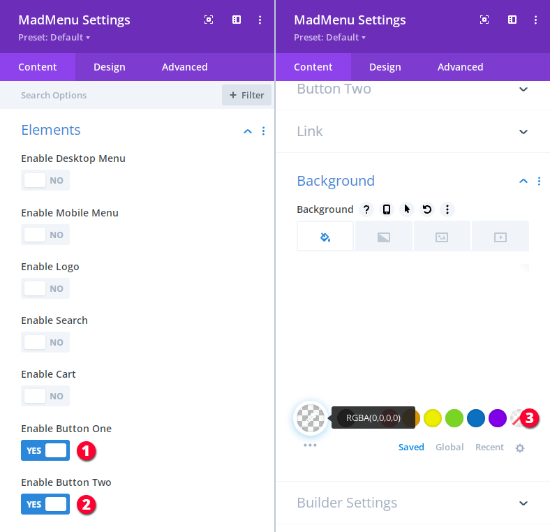
We need only the Button One and Button Two elements enabled, so, disable the rest. And also make the module background color transparent.
Add the Close and Logout Buttons Content
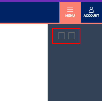
Both of the buttons have no content, so, let’s add it.
The Button One will be the Close button and the Button Two element will be the Logout button.
We don’t need the Auth content for the Close button, so, we’ll add only the Normal content to Button One:
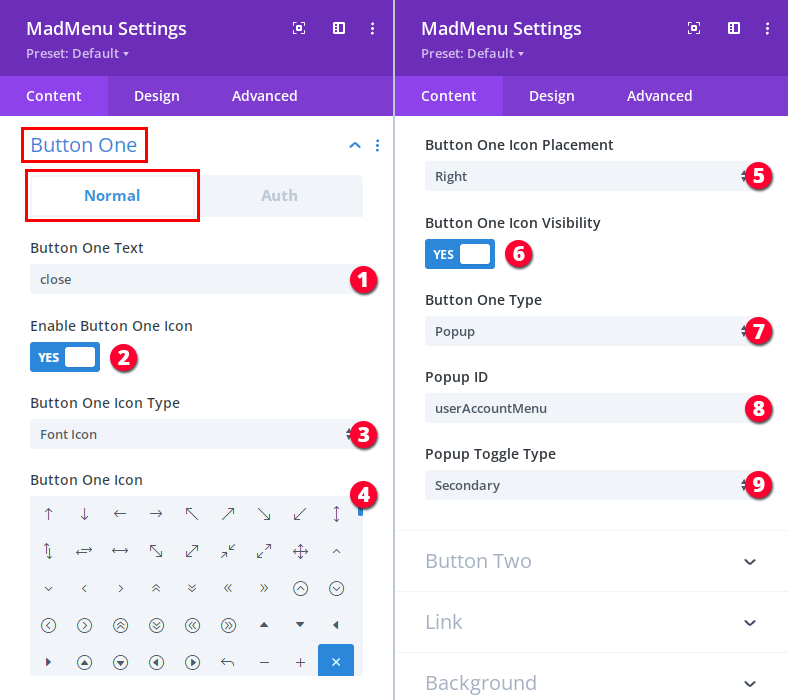
- Add button text: close.
- Enable the button icon.
- Select the Font Icon for the icon type.
- Select the X icon.
- Place the icon to the right of the close text.
- Make the icon visible on all devices.
- Set the button type to Popup.
- Add the same popup ID that we’ve added to the user account menu section: userAccountMenu.
- The Close button will be closing the user account menu which already has a primary toggle (the Account button), so, we need to make it the Secondary toggle(because a popup must have only one Primary toggle and all additional toggles must be Secondary).
For the Logout button we don’t need the Button Two Normal content but the Auth content only because we need the button to be a logout button (which is the default configuration of the button element’s Auth settings).
Make sure you enable the Logged In Mode in the module’s Builder Settings when you are working with the Auth content.
So, let’s add the Button Two element’s Auth content:
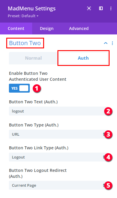
- Enable the Auth content.
- Add the button text: logout.
- Leave the default value of the button type: URL.
- Leave the default value of the link type: Logout.
- Set the logout redirection to Current Page.
Both buttons are now fully functional, clicking the Close button coses the user account menu, while clicking the Logout button logs the user out (you can test that on frontend).
Styling the Close and Logout Buttons
Let’s adjust the module spacing, add a bottom border to separate the buttons from the rest of the menu content, and align the buttons horizontally:
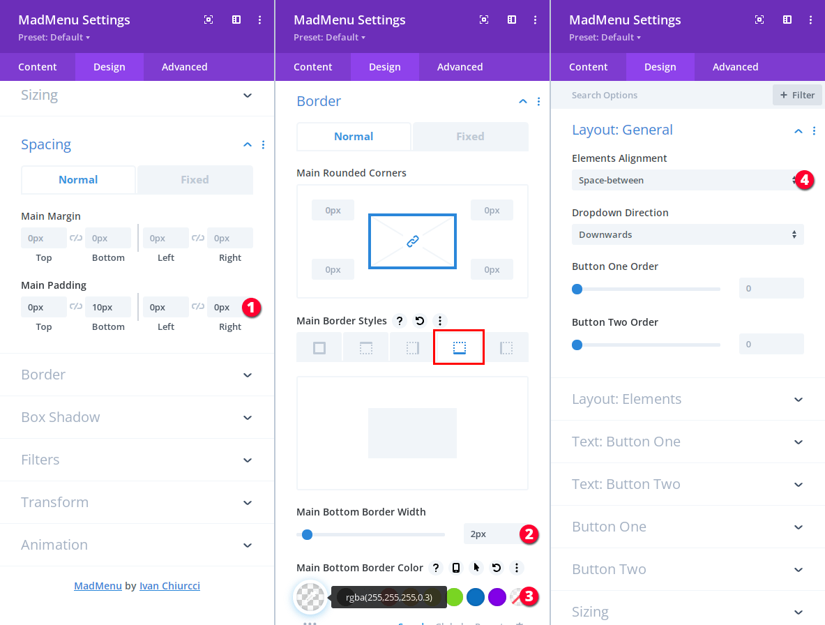
- Set the module main padding: 0px 10px 0px 0px.
- Set the module buttom border width to 2px.
- Set the module buttom border color to rgba(255, 255, 255, 0.3).
- Set the elements alignment to Space-between.
Next, let’s apply the Close button layout and text settings:
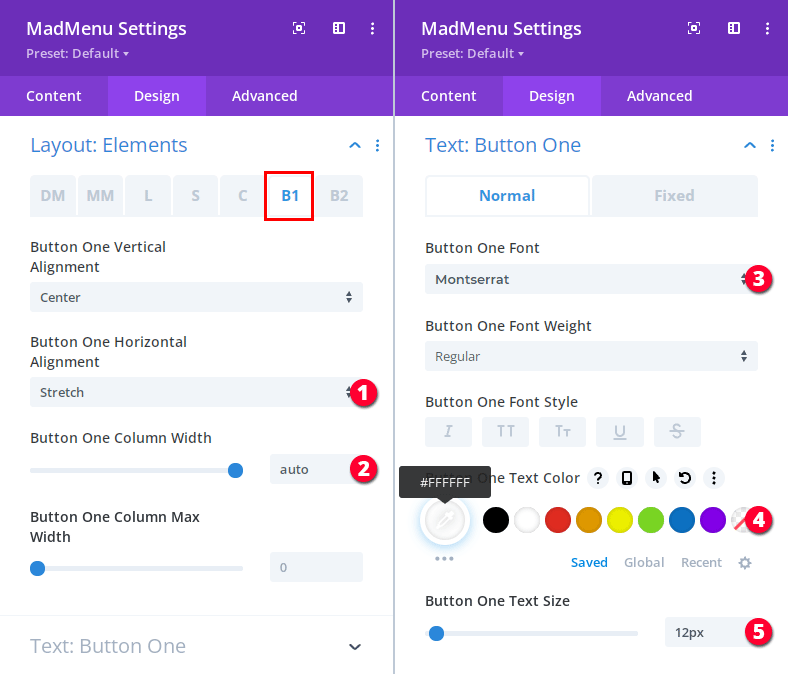
- Stretch the button horizontally (Design -> Layout: Elements -> B1 tab).
- Set the button column width to auto (Design -> Layout: Elements -> B1 tab).
- Set the font family to Montserrat (Design -> Text: Button One).
- The text color should be white: #ffffff (Design -> Text: Button One).
- Set the text size to 12px (Design -> Text: Button One).
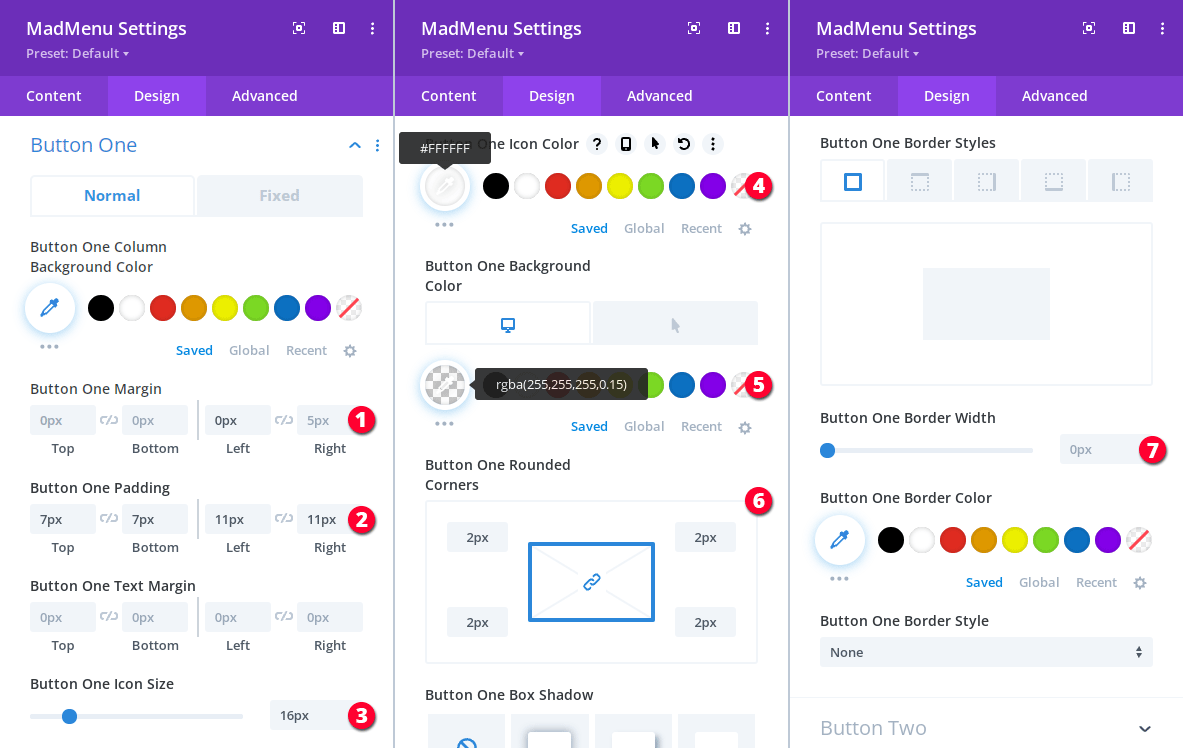
Let’s also apply the Close button design settings in Design -> Button One:
- Button margin: 0px 0px 0px 5px.
- Button padding: 7px 7px 11px 11px.
- Button icon size: 16px.
- Button icon color: #ffffff.
- Button background color: rgba(255, 255, 255, 0.15), and rgba(255, 255, 255, 0.25) for hover.
- Button border radius: 2px.
- Button border width: 0px.
And that’s it for the Close button.
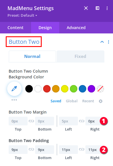
The Logout button layout, text and design settings are exactly the same as the Close button’s, so, simply repeat them for the Button Two element.
However, the spacing is a little bit different:
- Set the Logout button margin to 0px 0px 5px 0px.
- Set the Logout button padding to 9px 9px 11px 11px
Menu Items
The only thing left to do for the user account menu is to add the menu items.
For this demo header we’ll be using Divi MadMenu module Button elements for creating menu items.
The menu has five menu items, so, we will need to add two modules with both button elements enabeld and one module with only one button element enabled.
All menu items have the same design, so, we’ll design both button elements of the first MadMenu module and then duplicate it as many times as we need and just change the content of each item.
Add a new MadMenu module below the menu Close and Logout buttons, enable the Button One and Button Two elements only and remove the module background color.
Let’s create the first menu item using the Button One element and add it’s content in Content -> Button One:
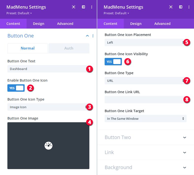
- Add the menu item text: Dashboard.
- Enable the icon.
- Select the Image Icon option.
- Add a custom image icon for this menu item.
- Place the icon on the left side of the text.
- The icon should be visible on all devices.
- Leave the default value for the button type: URL.
- Add the URL of the page which you want this menu item to be linking to.
Button One layout (Design -> Layout Elements -> B1 tab) and text settings (Design -> Text: Button One):
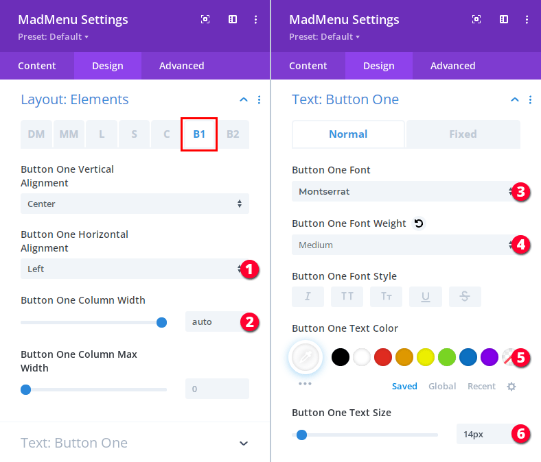
- Align the button to the Left.
- Set the button column width to auto to stretch it horizontally.
- Set the font to Montserrat.
- Set the font weight to Medium.
- Set the text color: #ffffff.
- Set the font size: 14px.
Button One design settings(Design -> Button One):
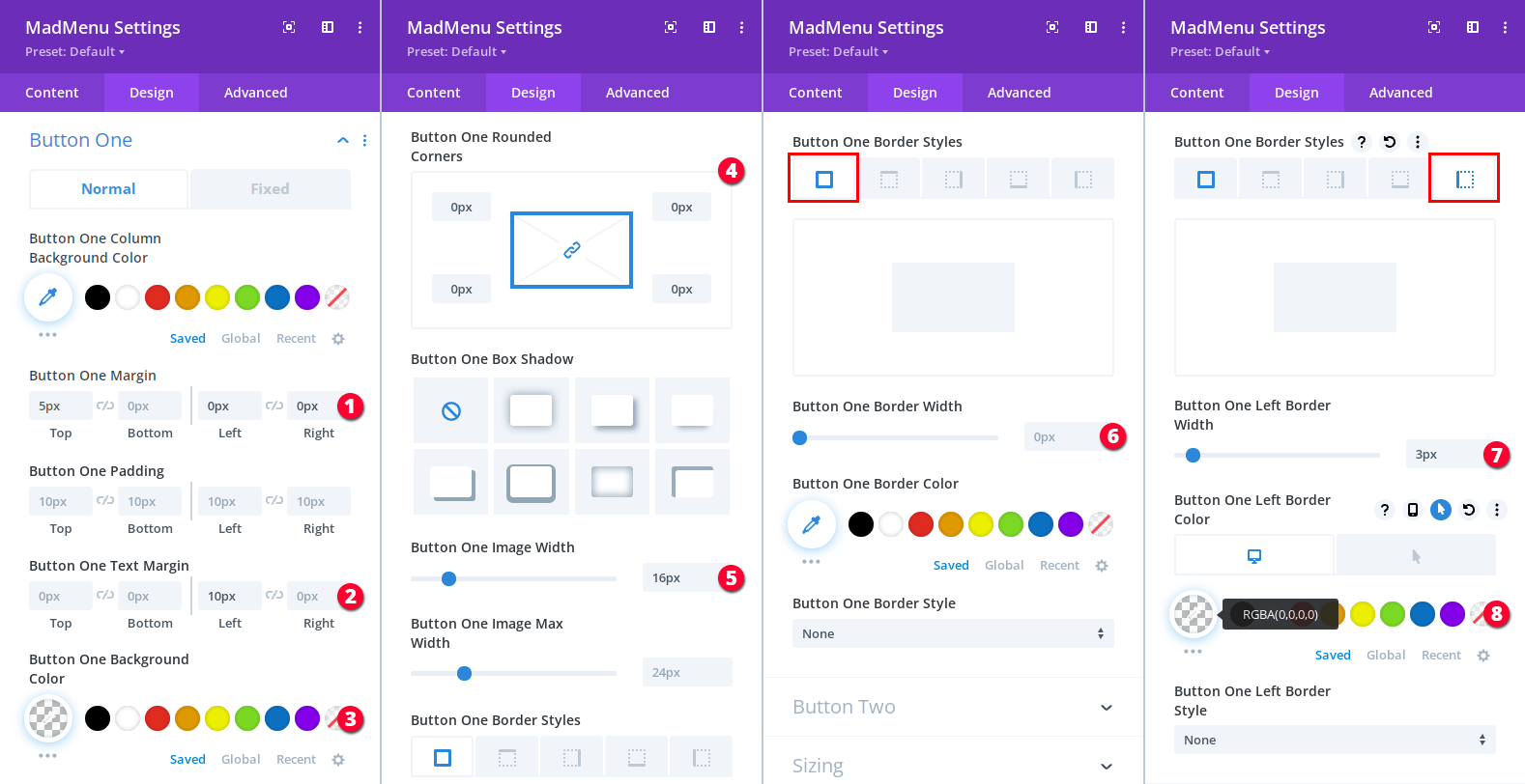
- Button margin: 5px 0px 0px 0px.
- Button text margin: 0px 0px 10px 0px.
- Button background color: transparent.
- Button border radius: 0px.
- Set the image icon width to 16px.
- Set the border width to 0px.
- Set the right border width to 3px.
- Make the right border color transparent, but set the hover color to rgba(255, 255, 255, 0.25) so that it becomes visible when the menu item is hovered over.
The first menu item (Dashboard) is ready, now use the Button Two element to create the Orders menu item. Everything is exactly the same except for the icon, text and URL:
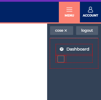
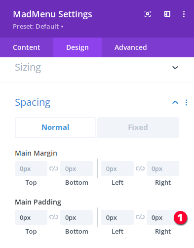
Both of the menu items are ready but, obviously, the module has too much padding applied which is not really necessary. So, let’s remove the module spacing in MadMenu Settings -> Design -> Spacing:
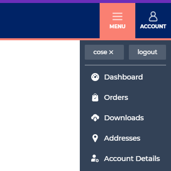
Now duplicate this MadMenu module to create the rest of the menu items, just add different icons, text and URL for each.
Wrapping Up
In this tutorial we’ve created the header Login Form and the User Account Menu.
When the logged out user clicks the Account button then the Login Form popup appears to allow the user to log in to his/her account.
Whereas if the logged in user clicks the same Account button then the User Account Menu is displayed.
In the next tutorial (Part 4) we’ll be adding the Social Icons sliding in from left when the user clicks the social networks button of the header.

