6 Quick Steps to Customize Divi Mobile Menu Submenu Using the MMC Plugin
All these and more can be easily done using the Divi Mobile Menu Customizer plugin. In a few clicks. Really.
In this post I would like to provide a quick overview of the Submenu Settings of the MMC plugin, we are going to cover the following features:
- Collapse Submenu
- Make Parent Item Clickable
- Enable Accordion
- Customize Parent Item Arrow
- Submenu Animation
- Submenu Styling
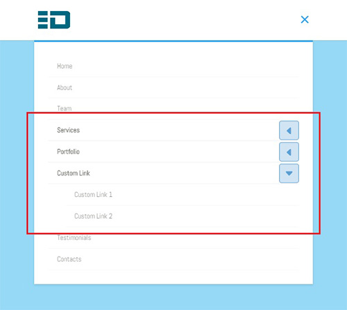
To start customizing the submenu we need to navigate to Divi->Theme Customizer->Mobile Menu Customizer->Submenu Settings section which looks like this by default:
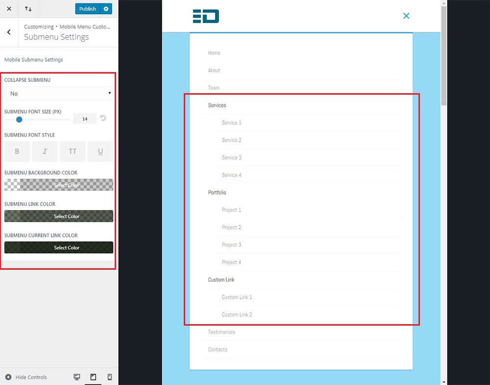
As you can see there are quite a few options available for the submenu, but that’s not all, the rest of options are hidded since we haven’t collapsed the submenu yet.
So, let’s start with the first option – Collapse Submenu.
Collapse Submenu
And if you want to have a fixed mobile menu(MMC plugin can do that as well) then some of the menu items at the bottom will not be reachable at all, and this is something you wouldn’t like to happen.
But this problem can be solved by simply selecting the Yes option for the Collapse Submenu setting which will collapse all submenus and make the mobile menu smaller.
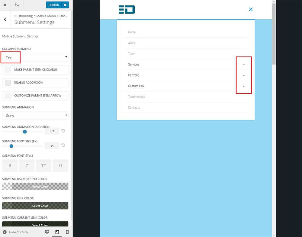
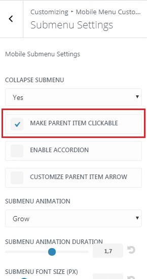
Make Parent Item Clickable
The answer is “no” since by default the collapsing submenu feature disables the parent item link and clicking on it will only expand/collapse the submenu.
But this might not be the desired behaviour, you may need the parent item still to be clickable, and to do this we need to check the Make Parent Item Clickable option which appears(along with some other options) on the options panel as soon as we enable submenu collapsing.
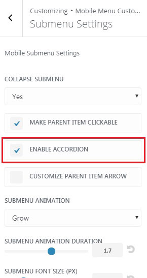
Enable Accordion
If you don’t want to provide this kind of user experience to your site visitors then consider enabling the accordion feature for submenu.
This feature will make the previously expanded submenu collapse automatically as the next one is expanded thus keeping only one submenu expanded at a time and preventing the mobile menu from becoming too long.
Customize Parent Item Arrow
Fortunately, the MMC plugin provides solution for this as well allowing you to fully customize the parent item arrow.
To enable arrow customization options we need to check the Customize Parent Item Arrow checkbox and the options set will show up below it.
When the arrow customization is enabled the default arrow styling is applied and it looks like this:
- Select a different icon
- Set the arrow rotation degree
- Change arrow size
- Apply border width and radius
- Adjust padding
- Set colors for arrow, its background and border
For example, you could make the arrow look like this in no time:
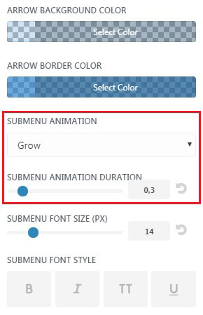
Submenu Animation
There is also the Submenu Animation Duration option which lets you set the animation duration.
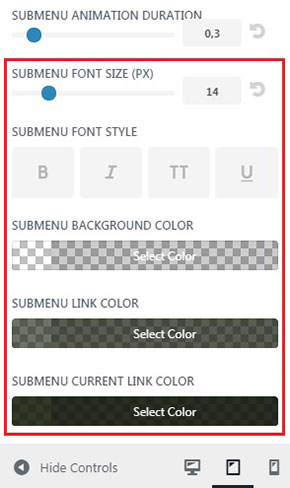
Submenu Styling
Never mind….I see it is updatable in the plugin area…
Ok, great!
When will your MMC plugin be able to update via plugin area verses me checking my purchase in elegant marketplace to see if the version has updated?
I rec’d your email today about 6 quick steps to customize….so I checked and saw a new version which I downloaded from the marketplace)
Hi Dean.
MMC plugin has the auto-update feature, you can update it from the WP dashboard but first you need to activate your license key.