The Smooth Divi Headers Templates Pack has just been updated with 4 new header templates. Upgrade your Divi website header effortlessly and for FREE now!
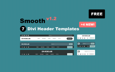
Smooth Update: Added 4 New Divi Header Templates (Free Download)
read more
The Smooth Divi Headers Templates Pack has just been updated with 4 new header templates. Upgrade your Divi website header effortlessly and for FREE now!

In this tutorial you’ll learn how to add WooCommerce live search to Divi menus showing live suggestions while users type the search query.
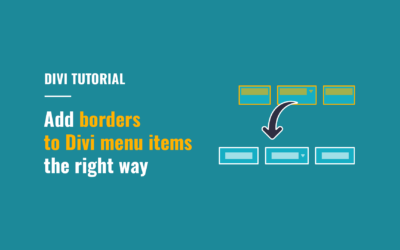
In this tutorial you will learn how to add borders to Divi desktop menu items the right way.
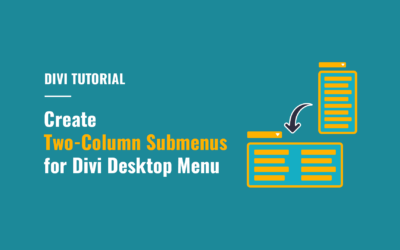
Create two-column submenus for Divi desktop menu to improve usability of lengthy submenus by making them more compact and easier to navigate.
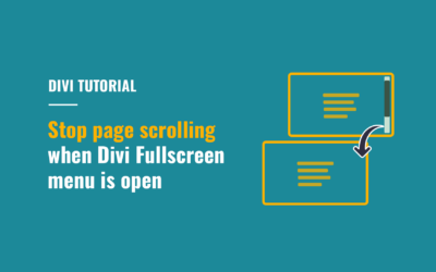
In this short tutorial I’ll show you how to disable page scrolling when you open the Divi Fullscreen or Slide-In menu, as well as the menus created using Divi MadMenu header popups.
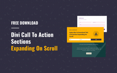
Download FREE Divi CTA Sections Expanding On Scroll.
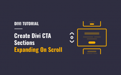
In this tutorial we’ll learn how to create Divi CTA sections expanding on scroll using the Intersection Observer API.
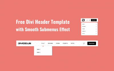
Free Download: Divi header template with smooth submenus effect, collapsed mobile menu submenus, CTA button and responsive design.
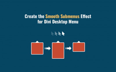
In this tutorial we’ll be creating the smooth submenus hover effect for Divi desktop menu submenus.
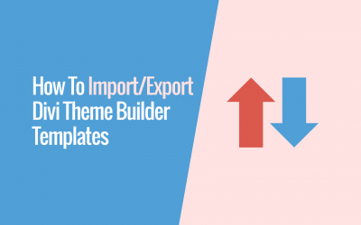
In this tutorial we’ll learn how to export Divi Theme Builder templates from one Divi installation and import into another.
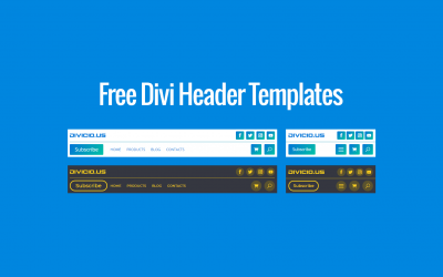
Download FREE Divi header templates with simple and responsive layouts, clean design, CTA button, collapsed mobile submenus, social icons, etc.
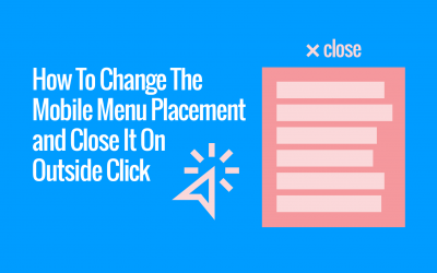
The Divi MadMenu v1.4 released recently adds some very useful new features for the Mobile Menu element.
It’s now possible to change the mobile dropdown menu placement, alignment and min-width, and also make it close on outside click.