Divi MadMenu Sneak Peek: The Most Advanced Divi Menu Module Coming Soon!
Since the introduction of the Divi Theme Builder I have been asked many times by the users of my menu plugins – the Divi Mobile Menu Customizer(MMC) and Divi Desktop Menu Customizer(DMC) – if they can be used to create menus using the Theme Builder.
Unfortunately, my answer was always “No” because these two menu plugins were built to serve a different need – they allow customizing Divi theme’s native(or default) header in Theme Customizer.
So, in this post I would like to present the new Divi menu module I have been working on for the last couple of months – the Divi MadMenu, which will be launching soon (subscribe to get notified).
The Divi MadMenu module allows creating headers using the Divi Theme Builder, and here is a brief demonstration of some of the features I’ve already implemented.
UPDATE: Divi MadMenu has been released! View the full list of features and the live demos here.
Please note that the MadMenu module IS NOT a replacement for the MMC and DMC plugins, you can use any/all of these products depending on your needs.
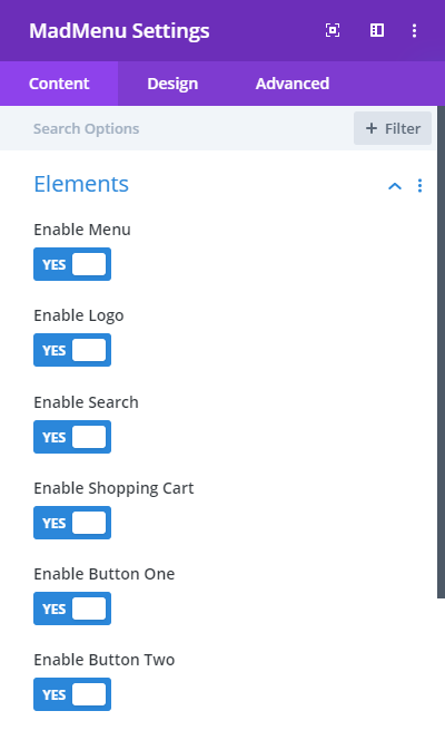
Header Elements
The MadMenu module allows you to add six different elements to your menu: Logo(image), Menu, Search, Cart and two CTA buttons (Button One and Button Two). You can also control the visibility of each element for all devices.
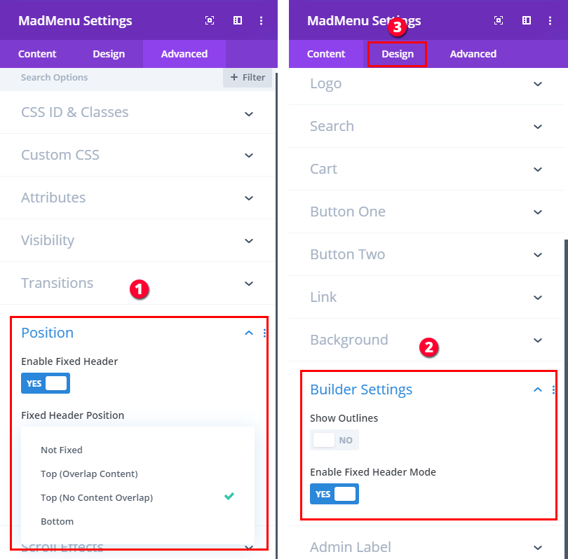
Fixed Header Styling
You can make your menu fixed (nothing new here because this is a standart Divi feature already) but MadMenu also allows you to apply a completely different styling to your fixed menu.
Each element has two identical sets of design options: one for the normal menu and the other one for the fixed menu. This includes spacing, sizing, colors, font options, etc.
To design your fixed menu you need to enable the Fixed Header then switch to the Fixed Header Mode and design it visually.
Flexible Header Layout
I didn’t add any predefined menu layouts but instead wanted to make the menu layout more flexible.
So, the menu elements can be re-arranged anyway you want. And you can do that differently for Desktop, Tablet and Phone in just a few clicks.

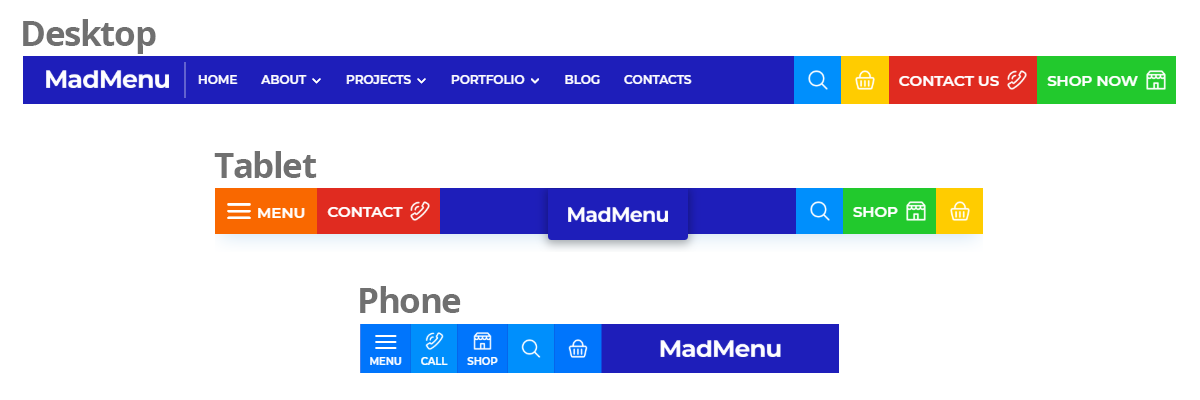
Responsiveness
One of the main goals I pursued when developing the MadMenu module is to make it’s layout responsive as much as possible.
You can add all six elements to your desktop menu and thanks to the available set of design options each of the elements can be designed in a such a way that all elements will fit nicely into smaller devices headers too and still remain fully functional.
Custom Menu Breakpoint
If you want to enable the mobile menu on desktop or disable it alltogether to have the horizontal menu on all devices, you can do that easily with the MadMenu module thanks to the Menu Breakpoint feature it comes with.
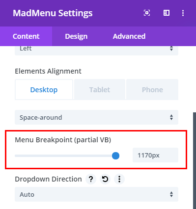
The Menu Breakpoint feature also helps avoid a situation when the horizontal(desktop) menu items start wrapping to the next line because there isn’t enough space for them to remain on the same line on smaller desktop screens.
You can easily set any breakpoint depending on your menu design.
Collapse Mobile Submenus
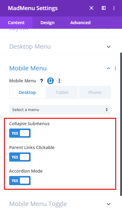
Collapsing the mobile menu submenus is certainly among the most demanded by Divi users mobile menu features.
The MadMenu module allows you to make the submenus collapsible and choose to keep the parent item links clickable or disabled.
Also you can enable the Accordion Mode for the collapsed submenus which allows to have only one submenu of the same level to be opened at a time.
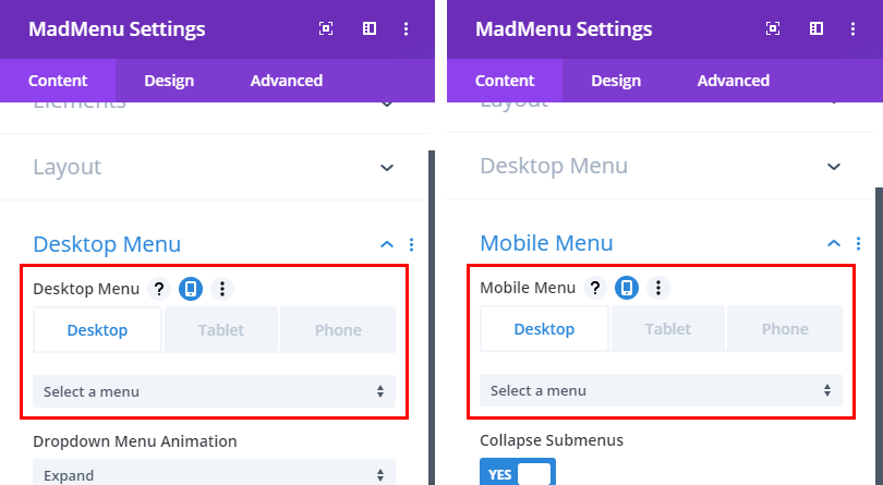
Assign Different Menus for Desktop and Mobile Devices
This feature allows you to assign different menus to all three devices: Desktop, Tablet and Phone.
For example, you may want to have a simple menu structure for Phone and more complex menus for Tablet and Desktop.
To do that simply create different menus “optimized” for each device on Appearance->Menus page and assign them to corresponding devices.
What’s next?
This is not the complete list of available features, there are various other “bells & whistles” that are not mentioned here and the Layout settings are still in the works which will make the menu layout even more flexible.
And there are many other features planned to be added to future versions of the module.
Please let me know what you think of the MadMenu module, I appreciate your feedback. Feel free to leave your thoughts and suggestions in the comments section below or contact me directly.
And subscribe if you want to get notified when the MadMenu module is released (you’ll also get these nice freebies after confirming your email address).
This is pretty cool – found it when looking for a way to create a vertical menu for a custom post type layout, with nested/accordion style menu on desktop. Any chance this would offer a way to do that? :D
Hi Melissa. Thanks for your question.
The initial version will not have a Vertical menu option, but it is planned and will be added later.
Will you allow a mobile menu that is stuck to the bottom of a mobile screen instead of to the top?
Yes, you can set a different position for fixed header for each device. For example, on Desktop you can fix it to top but on Tablet and Phone – to bottom.
hi when will this be available? i needed it yesterday!! lol
Still fine tuning and adding a few more features. Make sure you subscribe to stay updated.
This looks awesome! Can’t wait to get this.
Good morning.
I like your new development. The Divi MadMenu Plugin.
Do you plan to introduce the option of being able to customize the secondary menu? You can give the same configuration options as the main menu. For example, you can put in this secondary menu, besides the phone, email, social networks, buttons, affiliate area menu, my account, my courses, access, the cart…
Thank you.
This is something I’m already experimenting with. But not ready to provide more details yet.
Hi,
Looks fantastic….got a question.
Will this replace the Mobile Menu Customizer?
(I ask due to I have MMC and use it. So, when this becomes available an purchase it…will that make MMC obsolete?)
Hi Dean.
No, MadMenu won’t make the MMC plugin obsolete. As I mentioned in the post, the MMC and DMC plugins allow customizing Divi theme’s native header, whereas the MadMenu works with the Theme Builder.
So, if you’re using Divi theme’s native header then you should use the MMC and DMC plugins, and if you want to create headers using Divi Theme Builder then you’ll need to use the MadMenu module.
Both the MMC and DMC plugins will continue being supported.
thank you for validating this….
Hi, I’m really impressed, is this upcoming module included for lifetime members?
Thanks
Thanks for your question, Thomas. Yes, it will be available for both Annual and Lifetime members at no additional cost.
Wow nice! What will be the price for it :)
Thanks Achmed. This is something I have yet to decide. How much would you be willing to pay for it? :)
Wow. Just wow.
Thanks Asit :)
that’s awesome!
i just have a doubt, with this module can I create a customized menu for desktop and mobile? can you make a video showing how to customize the desktop menu? i want to see what options this module gives, especially when the dropdown menus are display
Thanks for your question, Alex.
Yes, you can design a menu for both mobile and desktop including submenus as well. The menu I am demostrating in the preview is created using a single MadMenu module, and as you can see the desktop submenus are designed differently for the Normal and Fixed headers. All customizations are applied without using a single line of custom CSS, the module provides options to customize both the main and submenu items differently(that includes colors, spacing, font options, borders, etc.). The same goes for the other menu elements as well.
I will prepare a detailed documentation when all features are implemented and the module will be ready for launch.
This looks fabulous! I have the MMC and am excited to try this out when you launch it.
Thanks Therese :)
Looks sharp! Two super basic features that I miss in the default Divi menu module is the possibility to have a center aligned desktop menu and a right or left aligned hamburger icon (without creating two separate modules). Centered desktop menus looks really nice but centered hamburger menu does not.
And a full width setting for the mobile menu (without removing all margin/padding from the hamburger icon).
Hi Victor.
As you can see in the preview video, the MadMenu module allows placing any element to the middle of the header, and it can be centered inside its container(or column). But it also depends on how you’ll design the elements placed to its left and right in order to make the middle element centered perfectly when looking at the header as a whole.
And you can set any width to the mobile dropdown menu regardless of the hamburger icon margin and padding.