Create Headers Using the Divi Theme Builder
Divi MadMenu is a flexible and powerful menu module for creating headers using the Divi Theme Builder*.
Features
WooCommerce Live Search
The Search element integrates with the FiboSearch plugin allowing you to add live search to your WooCommerce store to power your sales. Users get live suggestions while typing the search query.
Highlight Items On Scroll
Toggles the active state for menu items with anchor links based on current scroll position to indicate which section is currently visible in the viewport.
Stop Page Scroll
Stop page scrolling when a popup or popup menu is open(eg. when a fullscreen popup menu is open).
Vertical Menu Module
Create vertical navigations anywhere on the page. Learn more
Slide Submenus
Create slide submenus for mobile menu. Learn more
Header Popups
Use popups to create rich content headers. Learn more
Slide-In Menus
Create Slide-In menus appearing from any side of the viewport. Learn more
Fullscreen Menus
Create Fullscreen menus. Easily. Learn more
Button Authenticated User Content
Display different button content to logged in and logged out users (eg. create a Login/Logout header button). Learn more
19 Menu Animations
Apply different animations to the mobile menu and the desktop menu submenus. Learn more
7 different elements available
Enable only the header elements you need.
Fully customizable elements
Each element has a full set of responsive design options (spacing, sizing, colors, borders, box shadow).
Desktop Menu Breakpoint
Control the desktop menu visibility by setting a custom breakpoint.
Mobile Menu Breakpoint
Control the mobile menu visibility by setting a custom breakpoint. Works independently from the Desktop Menu Breakpoint.
Add different menus for each device
Use menus with different menu items for each device (Desktop, Tablet and Phone).
Collapse mobile menu submenus
Prevent the mobile dropdown from expanding beyond the viewport by making its submenus collapsible.
Keep mobile parent links clickable
Choose whether to keep the collapsed submenu parent link clickable or disabled.
Mobile menu Accordion Mode
Allow only one expanded mobile submenu at a time.
Add label to mobile menu toggle
Add text to the hamburger icon. Eg. “Menu”. Can be different for the opened and closed menu.
Control label placement responsively
Choose where to place the label on different devices(Top, Right, Bottom or Left). Applicable to CTA buttons’ labels as well.
Two CTA Buttons available
Button One and Button Two elements. Can be used as label only, icon only or label&icon buttons (responsively).
WooCommerce Cart Contents
Show the cart contents (items count and/or total amount) in the header. Highly customizable including the AJAX live update option.
Upload image icons for elements
Upload custom image icons for the Search, Cart and CTA button elements.
Enable Fixed Header
Make the header fixed.
Use a Fixed Header Logo
Upload a different logo image for the Fixed header.
Fixed Header Styling
Apply a completely different styling to the Fixed header triggered on scroll. Eg. make it shrink, change colors, etc.
Set the Fixed Header position
The Fixed Header position can be set responsively either on the viewport top or bottom or can be disabled on certain device(s).
Fixed Header content overlapping
The Fixed header can be set to either overlap or push the page content down (prevent the page content from being covered by the header).
Elements Alignment
Align elements’ horizontally.
Elements Content Alignment
Align the elements’ content both horizontally & vertically.
Responsive ordering of the elements
Order elements differently for each device (Desktop, Tablet and Phone).
Element Column Width
Set the element’s column(container) width (auto, px, %, etc.). Learn more
Dropdown Menu Direction
Select the opening direction for the desktop submenus and the mobile dropdown menu.
Main Menu & Submenu styling
Style the main menu and the submenu separately (the menu container and the menu items both for the desktop and mobile).
Element label styling
A full set of text options is available for styling the labels of the Mobile Menu Toggle, Button One and Button Two.
Control visibility of the elements
Elements visibility can be controlled responsively.
Builder Settings
Settings for improving the header design workflow. Have effect in Divi Builder interface.
Automatic updates
Divi MadMenu can be updated to the latest version from within the admin dashboard with a click.
Documentation
A detailed documentation is provided to make it easy for you to get started using the plugin.
More features coming soon
The list of features provided here is just a fraction of what has been planned for Divi MadMenu. More great features coming soon!
Demos
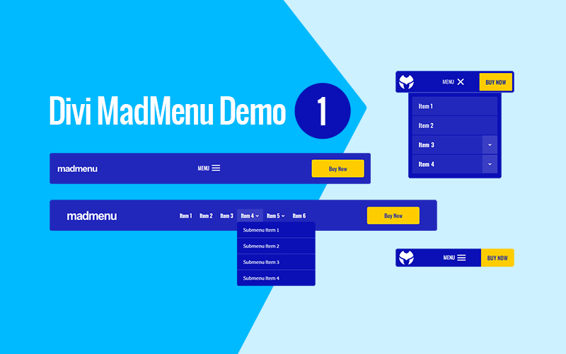
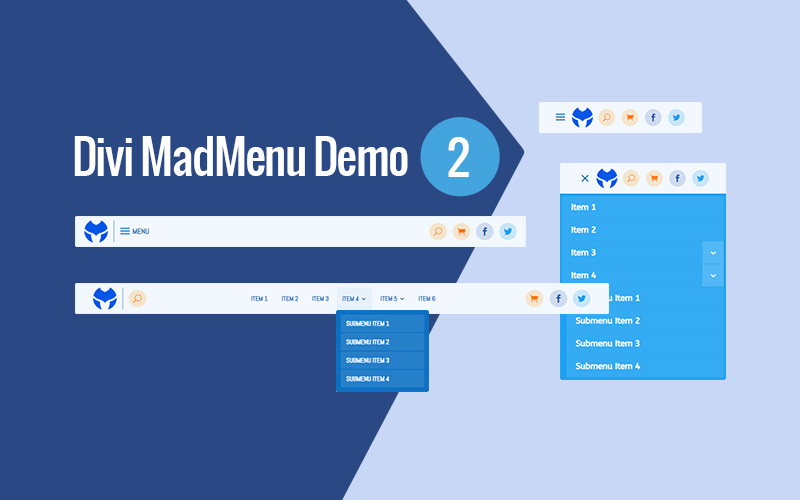
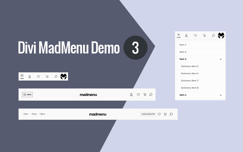
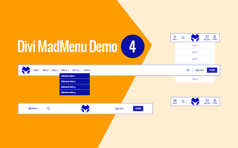
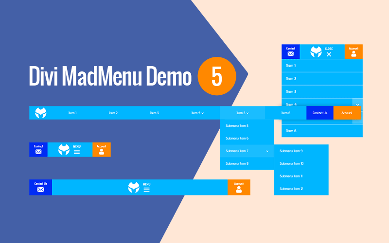
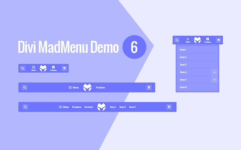
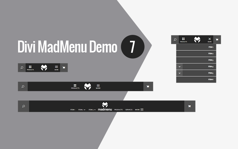
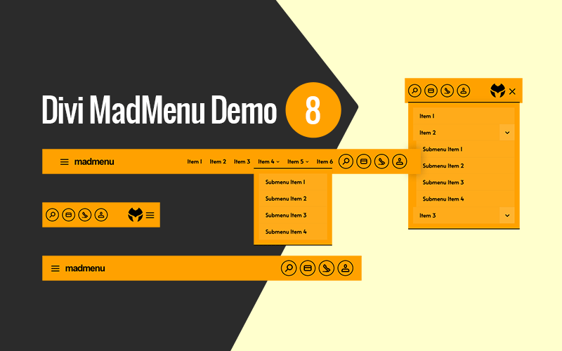
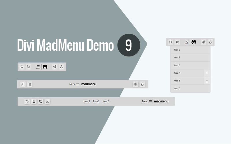
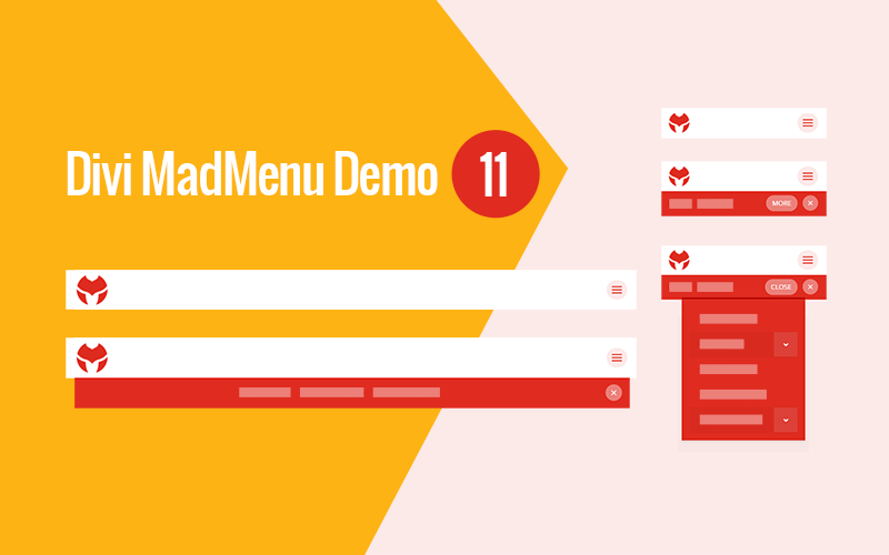
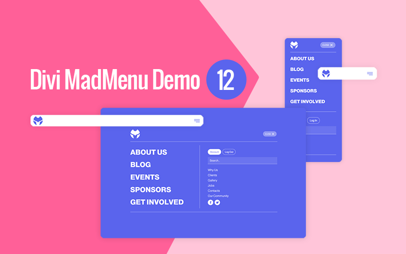
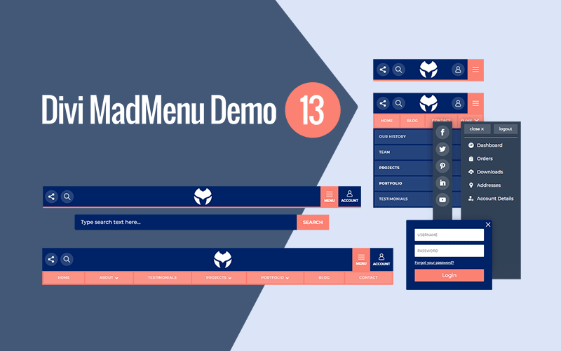
Divi MadMenu comes with ready-to-use demo header layouts. Simply import the demo header, add your content(menus, icons, etc) and you’re ready to go!
Demo 1
Demo 2
Demo 3
Demo 4
Demo 5
Demo 6
Demo 7
Demo 8
Demo 9
Demo 10
Demo 11
Demo 12
Demo 13
Documentation
Divi MadMenu plugin has been thoroughly documented to help you get started easily. The full documentation can be accessed here.
Tutorials
Divi MadMenu comes with a growing list of helpful tutorials that will help you get the most out of the extension. You can find the tutorials here.
Licensing
The Unlimited Sites License includes 1 year of support and updates and allows the product to be installed and activated on unlimited number of sites.
For more info please refer to our Terms of Agreement.
30 Day Money Back Guarantee
If for any reason you are not satisfied with the Divi MadMenu or it just does not meet your expectations, you can request a full refund within the first 30 days from the date of the purchase and you’ll get your money back fully. It’s a completely Risk-Free purchase!


