Divi MadMenu v1.6: Introducing Header Popups
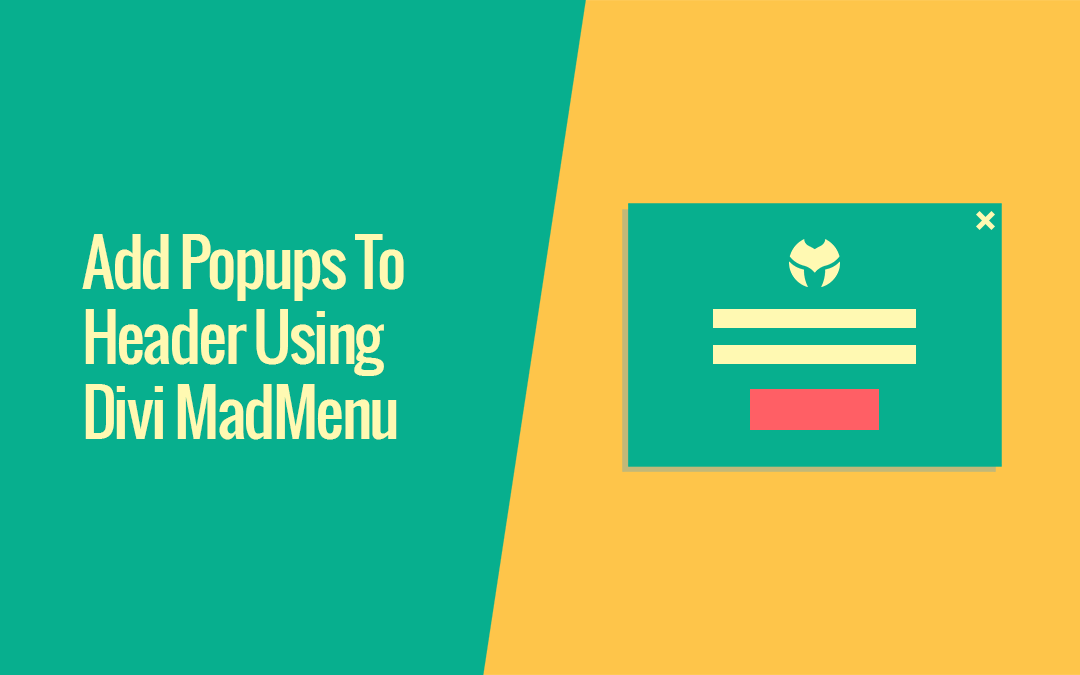
Introducing the biggest Divi MadMenu update yet: the Header Popups feature. Add popups to your Divi website header and do a lot more than that!
Introducing the biggest Divi MadMenu update yet: the Header Popups feature. Add popups to your Divi website header and do a lot more than that!
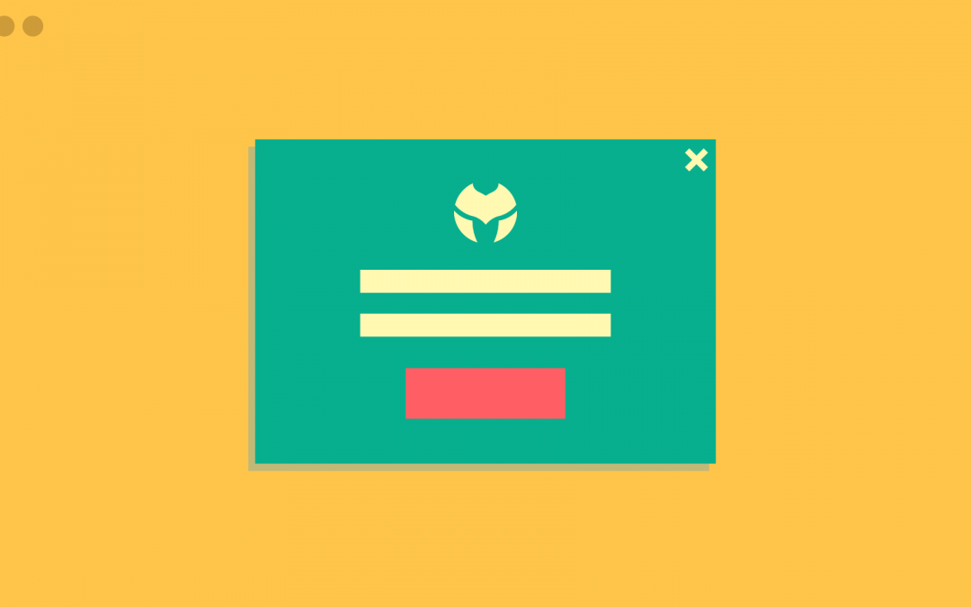
In this post I would like to show a preview of what is coming soon with v1.6 of the Divi MadMenu plugin – the Header Popups. This feature allows adding popups to the website header unlocking lots of new possibilities for header design.
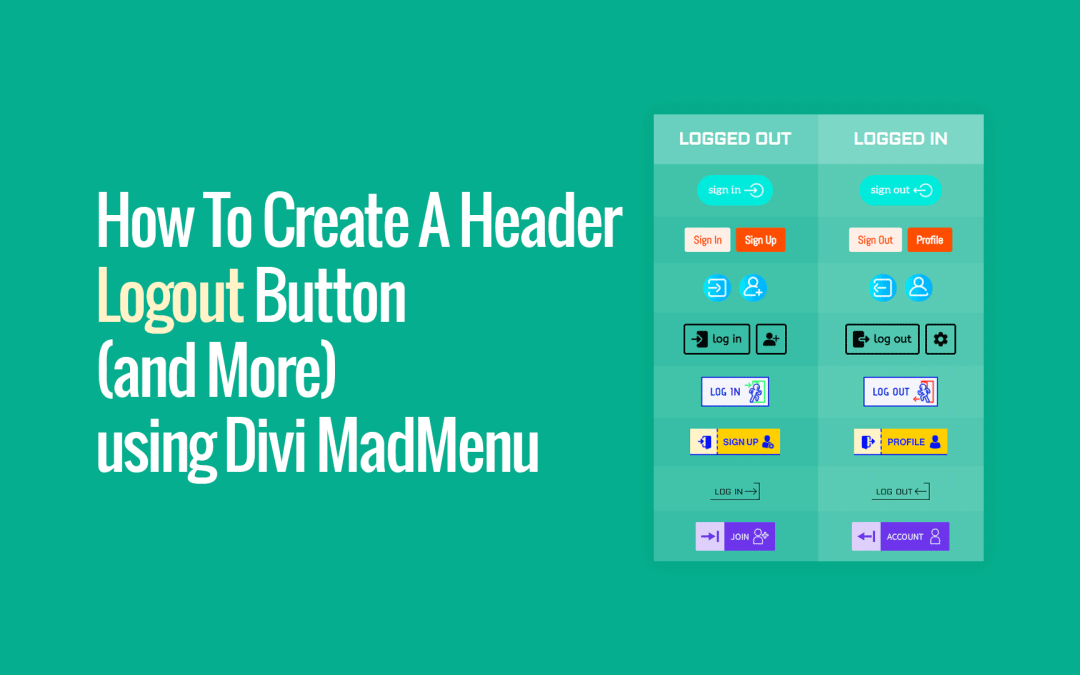
Show different button content to logged in users (eg. ceate a Logout button) using the Divi MadMenu Button’s Authenticated User Content feature
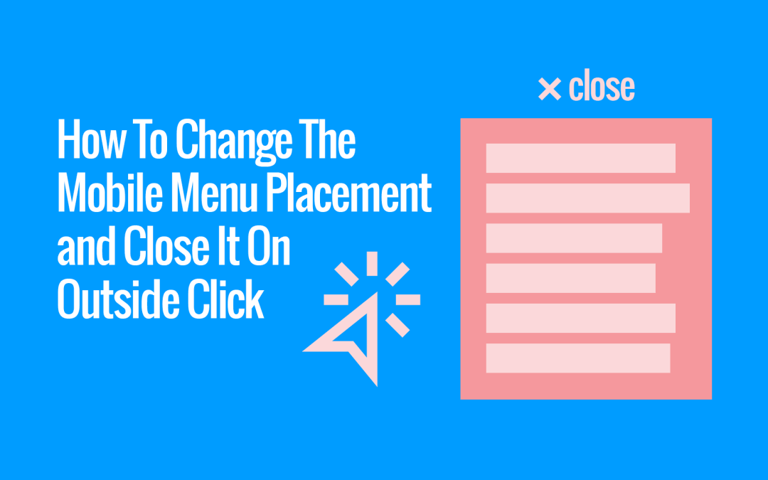
The Divi MadMenu v1.4 released recently adds some very useful new features for the Mobile Menu element.
It’s now possible to change the mobile dropdown menu placement, alignment and min-width, and also make it close on outside click.
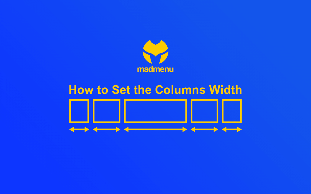
One of the features that make Divi MadMenu so flexible when it comes to creating reponsive header layouts is the ability to control the header elements column widths.
In this tutorial we will learn how to set the Divi MadMenu elements column widths and control the elements alignment using this feature.
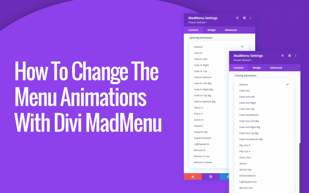
Divi MadMenu allows changing the desktop and mobile menu animation with a click, just select any of the available cool animations!
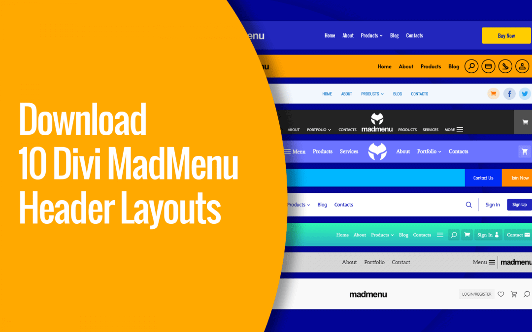
Download 10 ready-to-use Divi MadMenu header layouts that will make it even easier to get started creating headers using this powerful menu module. All you need to do is to import the header layout, add your content and you’re ready to go!

The Divi MadMenu module has been released and now is available for purchase! Divi MadMenu is a menu module for Divi allowing to create headers using the Divi Theme Builder. It is a powerful tool coming with lots of features providing a great flexibilty for header design.

The first beta version of the Divi MadMenu module is available for download.
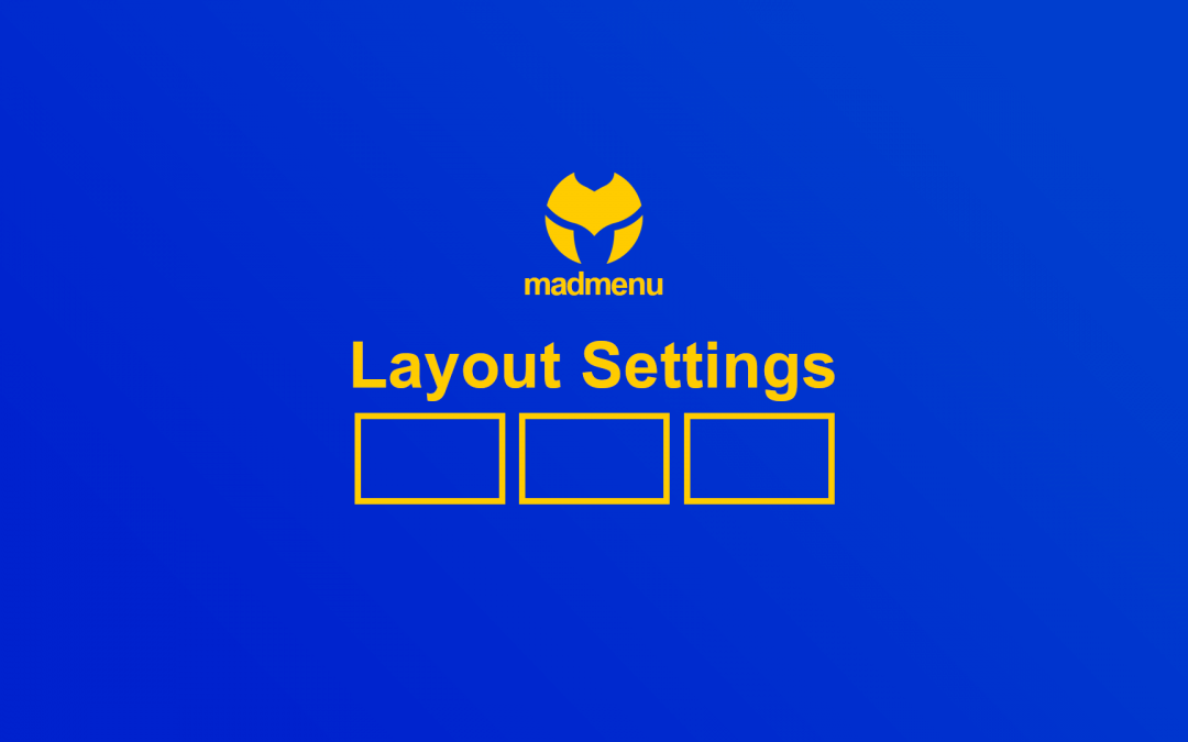
Divi MadMenu Layout Settings allow changing the elements ordering, set their column width and alignment, and align the element content both vertically and horizontally. Also you can control the visibility of both Desktop and Mobile menus by adjusting their breakpoints.